Share With Others


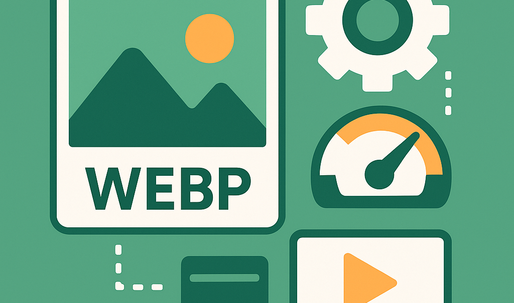
Image & Media Optimization Deep-Dive
Images and media files are some of the biggest factors that affect WordPress performance. A single oversized banner or autoplay video can drag load times down by several seconds. For sites that rely heavily on visuals—like portfolios, blogs, or online stores—optimization is essential.
The good news is that you don’t need to sacrifice quality for speed. With the right formats, compression methods, and loading strategies, you can deliver beautiful visuals that load quickly even on mobile devices.
Why Images Matter for Speed
On most WordPress sites, images make up 50–70% of total page weight. If they are too large, uncompressed, or poorly implemented, they directly impact:
-
Largest Contentful Paint (LCP): Hero images often determine how fast a page feels to load.
-
Cumulative Layout Shift (CLS): Missing dimensions or late-loading banners cause elements to jump.
-
Time to First Byte (TTFB): Heavy media can delay the server’s response.
Every optimization step helps improve these metrics.
Choosing the Right Formats
Not all image formats are created equal.
-
JPEG: Best for photographs with many colors. Smaller file size but some quality loss.
-
PNG: Good for transparency and graphics. Larger file size.
-
WebP: Modern format supported by most browsers. Smaller size, better quality.
-
AVIF: Newer than WebP, even smaller file size, excellent quality. Still gaining adoption.
For most sites, converting to WebP or AVIF provides the best balance of speed and quality. Plugins like ShortPixel, Imagify, or EWWW Image Optimizer can automate this conversion.
Compression and Resizing
Two key steps make the biggest difference:
- Resize before upload.
Don’t upload a 4000px-wide image if it only displays at 1200px. Resize it to the exact display size.
- Compress intelligently.
Use lossy compression for photos and lossless for graphics or logos. Most plugins offer both options and let you set global defaults.
A well-compressed WebP image can be 70–80% smaller than its JPEG equivalent.
Responsive Image Techniques
WordPress supports responsive images through the srcset attribute. This allows browsers to load the right image size depending on the user’s device.
For example:
<img src=”hero-1200.webp”
srcset=”hero-600.webp 600w, hero-900.webp 900w, hero-1200.webp 1200w”
sizes=”(max-width: 600px) 600px, (max-width: 900px) 900px, 1200px”
alt=”Optimized hero image”>
This ensures mobile devices don’t waste bandwidth downloading desktop-sized images.
Preloading Critical Images
Your hero image is often the Largest Contentful Paint element. To optimize it:
-
Add fetchpriority=”high” so browsers load it first.
-
Set loading=”eager” instead of lazy loading.
-
Always define width and height to prevent layout shifts.
This single adjustment can improve LCP by seconds.
Lazy Loading Non-Critical Media
Images below the fold don’t need to load immediately. Lazy loading ensures they appear only when a visitor scrolls near them.
WordPress now supports loading=”lazy” by default. Plugins like WP Rocket or Perfmatters extend this to iframes and background images.
For video embeds, you can replace a heavy YouTube iframe with a static thumbnail and only load the video player when clicked.
Background Videos and Heavy Media
Background videos look impressive but are often performance killers. If you use them:
-
Keep them under 1MB if possible.
-
Compress with modern codecs (WebM preferred).
-
Provide a static fallback image for mobile devices.
For image-heavy sites like galleries or manga readers:
-
Use CDNs with image optimization like Cloudflare Images or Bunny Optimizer.
-
Break galleries into multiple pages instead of infinite scroll.
-
Enable browser caching so repeat visitors don’t re-download the same media.
Tools for Optimization
-
Plugins: ShortPixel, Imagify, EWWW Image Optimizer, Smush.
-
Server-side solutions: Cloudflare Polish, Bunny Optimizer.
-
Manual tools: Squoosh.app, TinyPNG, Photoshop export.
Quick Checklist
-
Convert images to WebP or AVIF
-
Resize to correct display size before upload
-
Use lossy compression for photos, lossless for logos
-
Preload hero image with fetchpriority=”high”
-
Lazy load below-the-fold media
-
Replace video iframes with preview thumbnails
-
Use CDNs for image-heavy sites
Images can make your WordPress site beautiful, but they don’t have to slow it down. By using modern formats, resizing and compressing files, preloading critical images, and lazy loading the rest, you can deliver a fast, smooth experience across devices.
For portfolio sites, ecommerce stores, or blogs rich in visuals, these optimizations aren’t optional—they’re the key to balancing design and performance. A site that looks stunning and loads instantly is always a winning combination.